Silver Water Lily Printing Process
April 13th, 2008
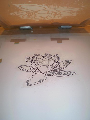
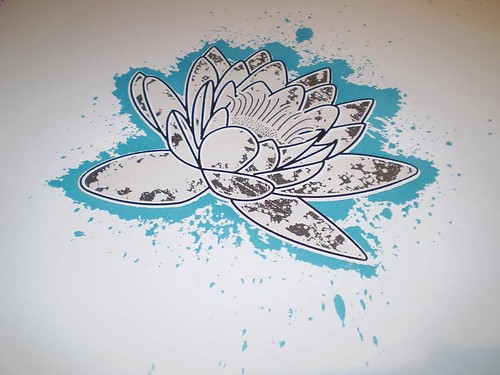
I looked through my photo collection and found some water lilies which I had photographed in Erlangen’s Botanical Gardens when I was there a few years ago. I redrew the flower from the photograph, simplifying it for a screen print. I was planning on doing a two colour screen print using black as the first colour and then silver, overprinting areas of the black. I had a half-litre of silver ink for another job but I found it was too light on a white board (but great for creating an effect similar to spot-varnishing), so I never used it.
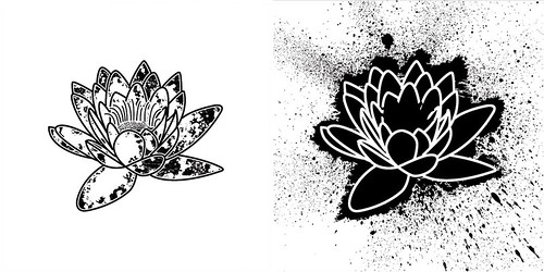
I decided to use it for this job and have it overprint some areas of the black print to produce a more definite silver colour and create a silver halo-effect which would only be visible when held to the light on areas which weren’t printed using the black. In the above photo, the image on the left is the black first print and the image on the right is the silver overprint. It overlaps the black on the leaves of the flower. A lot of the ’spatter’ on the silver artwork (above right) didn’t get transferred onto the screen as I edited the acetate used to make the screens to exclude this. I thought it was too much.

I forgot to take photos of the screen making process, I will definitely try for next time, but here are the two screens for the two colours.
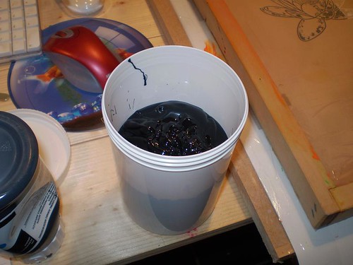
First colour was the black undercoat. Black ink is my least favourite ink to print with as it stains almost everything it comes into contact with and is harder to clean than any other colour. Maybe this is more psychological than anything else, but I just don’t like printing it for those reasons.
After mixing the ink with medium (which stops the ink drying up on the screen) I inked up the screen and did the first prints. They turned out well and I was happy with the image. I printed about 60 prints, I was planning on an edition of about 50 but I needed extra in case of problems on later print runs.
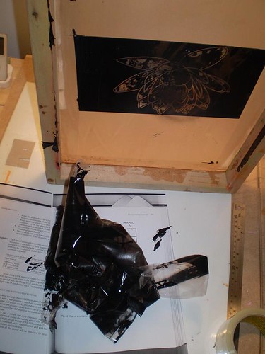
After cleaning off the black ink (worst part of this job) I left the screen to dry, along with the prints, until the next evening when I would put on (what I thought would be) the final print colour, silver.
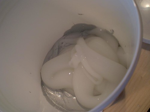
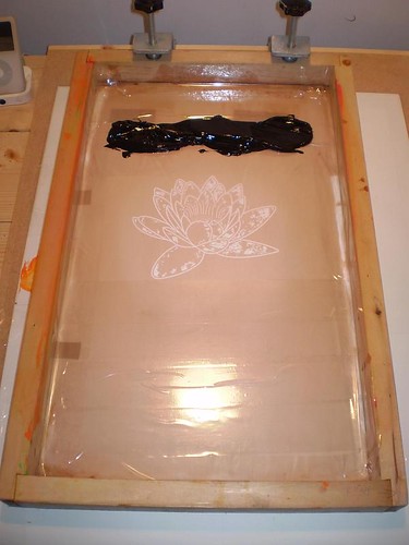
I have an order I like to do things when I’m starting a new print run. I first like to tape up the screen to make cleaning easier (just pull the tape off) and to stop ink from getting to places where it’ll make the cleaning process harder (like the edges of the screen). Then I mix the ink, sometimes I use a pure colour or else I mix two colours together to form another colour, depending on the job. In the photo above, I am mixing pure silver with the screen printing medium (see above).

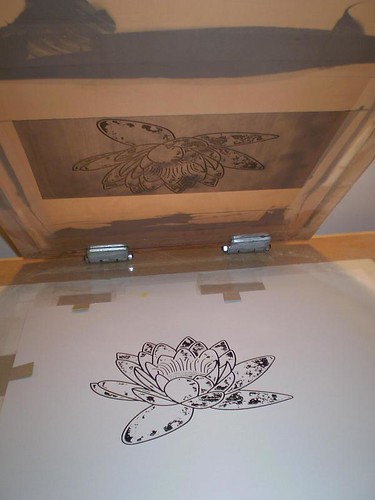
Once I ink the screen up I make the test prints. Once I make the print I start to think that the silver ink is too light. I then make an actual print over a black print and the overprint works really well but the surrounding areas, printed on white, aren’t very definite. I decide to proceed anyway as I like the effect over the black. The ink usually dries darker anyway.
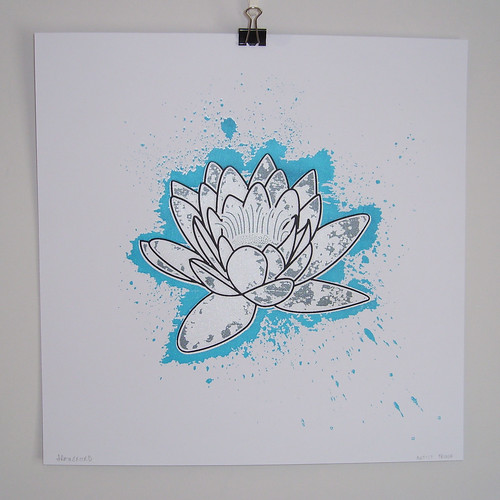
After I print the 50-odd prints with silver and allow them to dry, I still didn’t think the silver halo around the print was obvious enough. It made the flower look bare and look as if it was a single colour print in black. I needed to overprint the silver halo with another colour because otherwise I’d have nearly 60 prints which I wasn’t happy with. After going through my inks that I had, it came down to either red or blue. As I had already printed red in the my robot prints, decided to go with blue as I had a half litre of cyan ink.
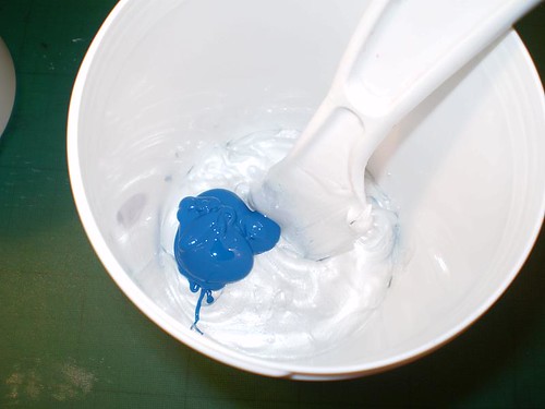
In keeping with the metallic silver, I mixed some cyan with about a quarter-litre of silver ink. Although the ratio of cyan to silver was small, it still coloured it really well and I ended up with a metallic blue which had a slight shimmer.
My next problem was the screen (or lack thereof) for the blue I didn’t want to make another screen due to time reasons so I created a mask using clear tape that matched the inside of the flower on the silver screen. Once that was masked off, I was left with the surrounding halo open and ready to print.

After inking up the screen and making test prints, I knew that this would really improve the print.
I started printing and finished up the run, late Friday evening. The prints were on SRA3 sized card but they were destined to be a 12″ x 12″ print. I went down to a nearby printers and got them guillotined to size. I didn’t get any photos of this step but it saves a huge amount of hand-cutting and is totally accurate.
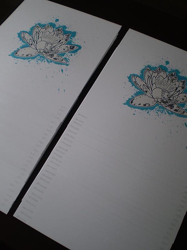
After signing and stamping (with my new stamp!) the 51 final prints, I was glad that all I had left to do was write this entry and get my photos onto flickr.
The prints are available for sale on my shop for only 15 euros. The full photo set is available on Flickr here.
I’m not sure what my next printing project will be, but I have the off-cuts, from the above print, left, which I’d like to use on something, as well as some fluorescent orange and pink inks. I’ll have to hit my sketchbook and come up with some ideas.
Post by John Rainsford
