Trees
November 25th, 2009
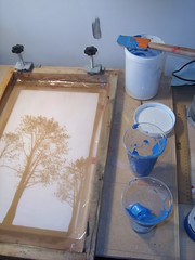
This is another belated post, this time for an exhibition which took place in June, 2009. Due to several reasons (lazyness being the most prominent) I only wanted to use a single screen for this print, but printing a solid colour is boring. I had seen a print on Flickr (seen here) which used multiple colours at the same time on a screen. This is commonly known as ’split fountain’ printing.
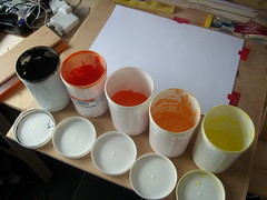
Split Fountain is when you put multiple colours in the fountain or ink well. In commercial printing, this is most commonly done when printing currency- if you’ve ever seen currency with multiple colours blending into each other, if you check out the printing under 10x magnification, you’ll see a consistent blend of colour with no halftones. This not only makes forgery that bit harder to do, I’d assume it makes the printing a bit of a pain, because of potential cross-contamination of inks, affecting the colour.
Only recently I came across this process on the excellent For Print Only website- a couple used this technique for printing their wedding cards.
Artwork
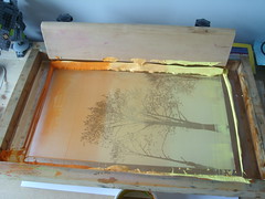
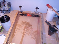
For the artwork, I had some silhouettes of trees that were in the ditch outside my office. I reversed the trees, so the image of the trees would not be printed. After creating the screen, I went to work in earnest. My first colours were an orange, (shitty) peaches and yellow colour scheme. I produced a couple of prints using the split fountain technique, and it worked really well. The only problem was that the colours, although blending together nicely, were too separate still. I did a number of prints squeegeeing along the long-edge, mixing up the ink half way through- I wanted a mixed up texture, not perfect bands of colour!
Black, Red and Grey
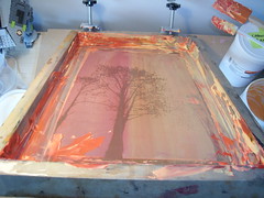
After cleaning up the screen and scooping the excess into an empty pot, I set the screen up again, this time I was squeegeeing short-edge down. I decided to use a black, grey and red colour scheme. Although the first few prints were fine, the black overpowered the other colours, making the prints very muddy looking.
Shades of Blue
My next colour scheme, having learned from last time, was a collection of blue hues, allowing for more subtle blends of colour, as opposed to a single colour overpowering everything else. I added in some Silver to the colours too, to give it more texture and affect. I was happy with the prints. Using shades of colour worked a lot better.
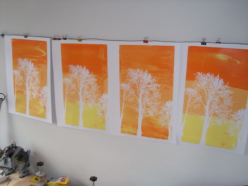
Longways
For my final trick, I decided to back to the orange, shitty peaches and yellow colour scheme, but print the short-edge down. I used the ink I scraped off the first print run, so the ink was thoroughly mixed up at this point, giving better mixed-up textures.
Twofer
In the run up to the exhibition, I had trouble choosing which print to enter into the exhibition. After much deliberation we decided (it was a group decision at this point) to put in two prints as one, commonly referred to as (but technically incorrect) a diptych. I use a local framer, who is so good all I have to do is give a basic direction and she decides everything else. I have yet to see a badly framed picture from her.
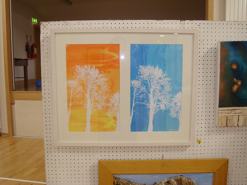
The diptych was exhibited and sold on opening night. More photos are on Flickr.
Post by John Rainsford
